


Occasionally I take on a straight-forward design project. Getting back to the basics of graphic design and layout helps me keep my design fundamentals sharp.
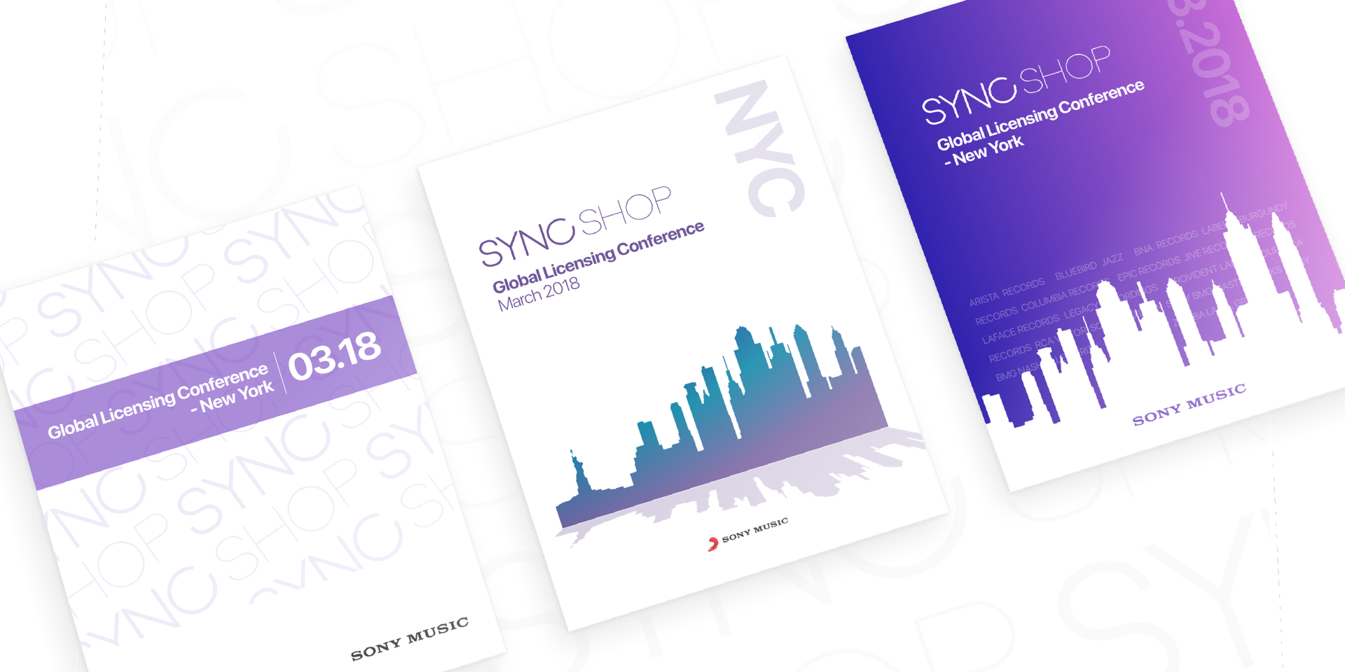
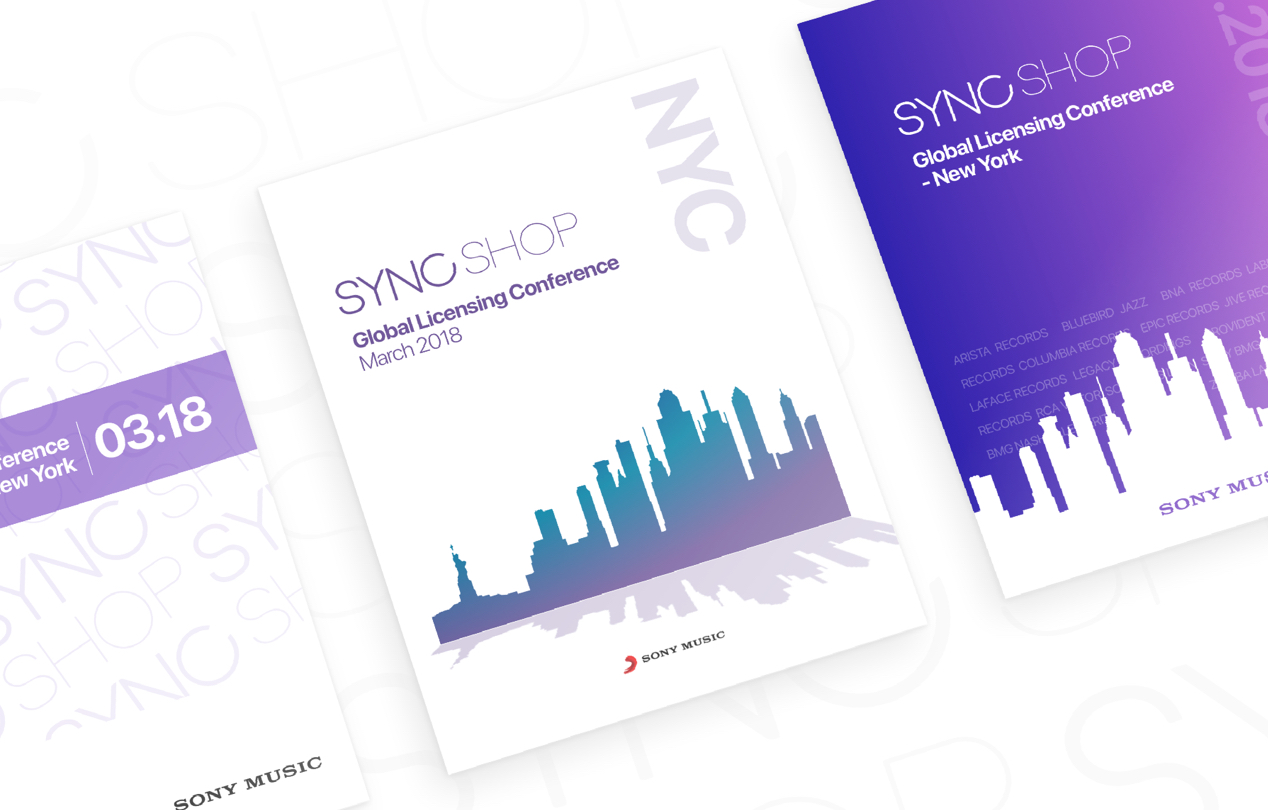
First up, fonts and color palettes. Knowing that the ask was "clean, professional, and modern", I chose Apple's SF Display Pro font. It seemed appropriate as a relative of Helvetica, made famous in New York through Vignelli's infamous subway maps.
With color I had two main choices - Sony Music red, or go with something a little more edgy. I was granted full creative control - so I decided to experiment with Pantone's color of the year - Ultra Violet.
The visual samples are focused on: New York, Music, and an overall corporate feel.
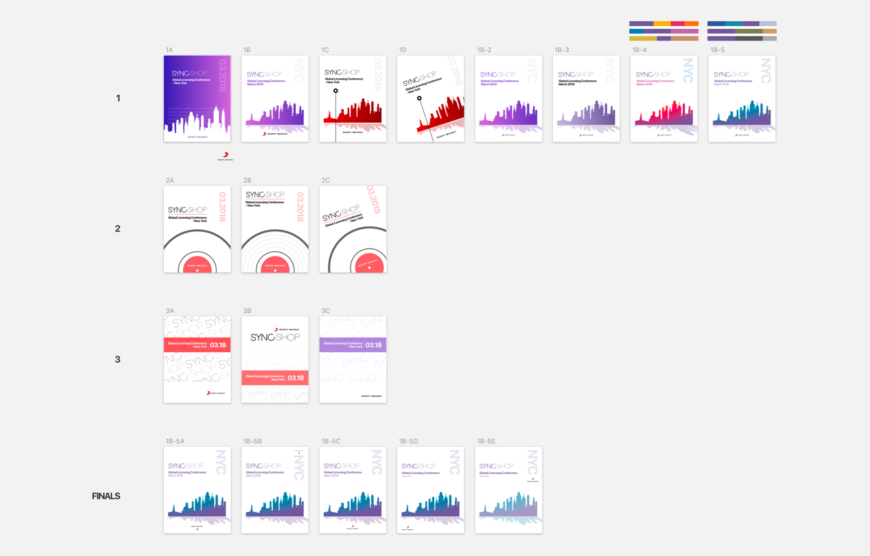
Using Invision to share comps and solicit some opinions, a final comp was selected as the main creative. SF Pro Display, Ultra Violet (with gradients).
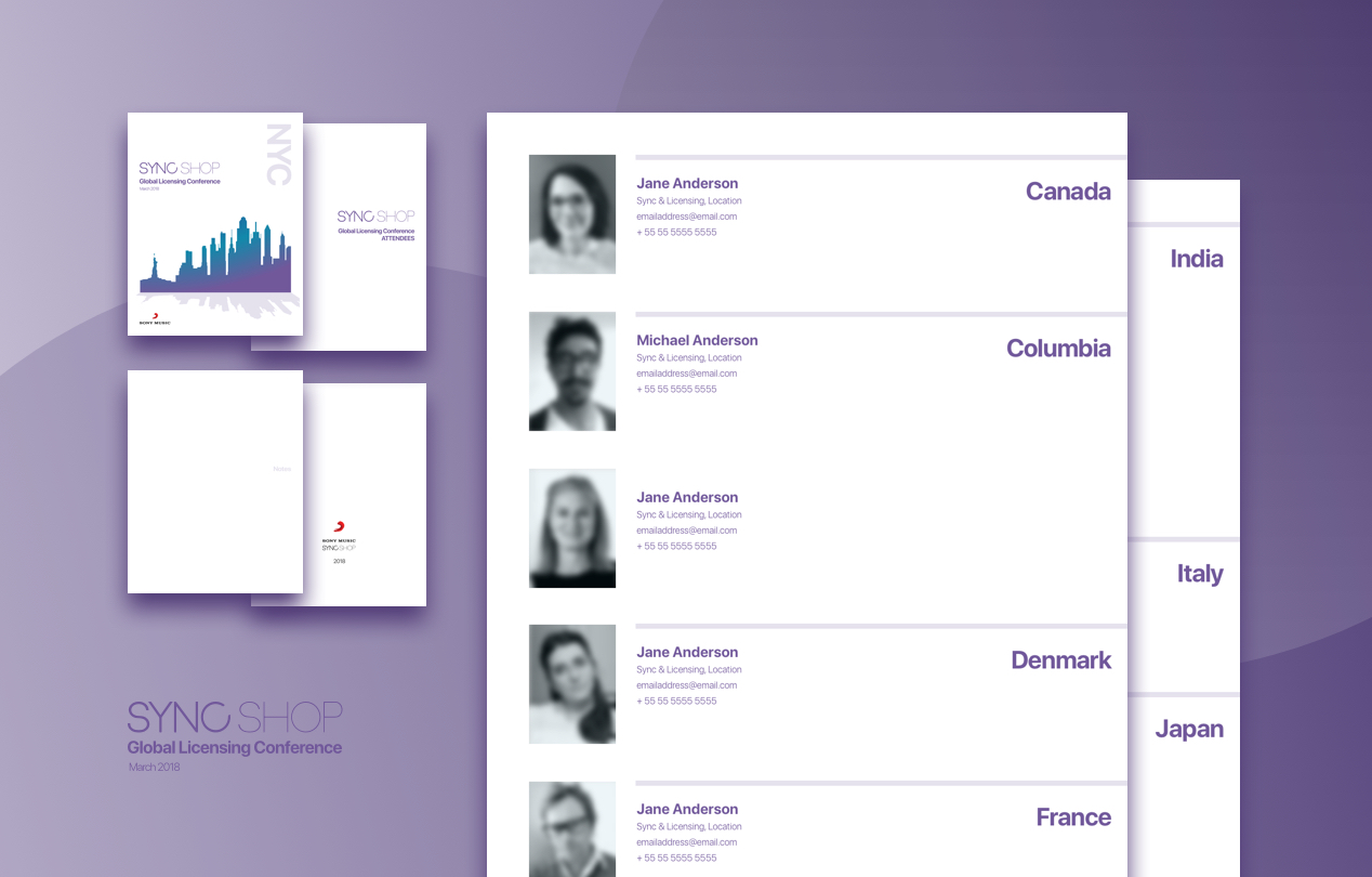
With the assets agreed to by the client, the handbook layout was next up. Printing anything is time consuming, so I needed to get this one out first.
I was given 41 employee photos that varied from black and white headshots, to full-body casual shots. Needing some cohesion, and a lowest common denomonator, I paired down to black and white headshots - coloring and cropping the set. The photos looked a little bland without color, so I applied an opacity fill overlay to blend a bit better. (shown: faces & names blurred for anonymity)
This layout now needed a grid, and some heirarchy. Tapping my UX background, I knew I needed a little Information Architechture and User Experience. How would a user use this? Probably to thumb through the book to find a person / by location. Check. Confirming with the client, layout heirarchy - country, first name (alphabetical), title, personal info . As a user, if I'm going flip through this handbook, I'll most likely be seeing a lot of new faces that I don't know. Based on a person's location, I would easily find them. Layout pattern: keep country close to the edge for initial search, followed by people alphabetically (first name). Add some pages for notes, and a back page watermark for fun.
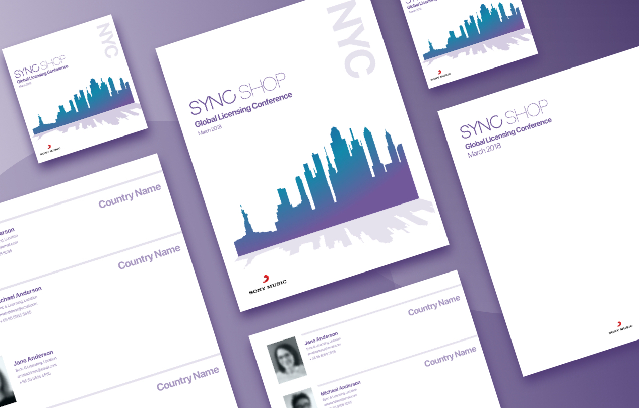
With all the different styles created for the handbook layout, it was a pretty simple translation into letterhead, stickers, and pdf. Thank you to my friends at Sony Music - as always. Our time together is always a pleasure.

When I started at Cornerstone in 2010, the company was pre-IPO and had less than 100 employees. When I left, we were the biggest name in Talent Management Software and had over 2000 employees. I knew I wanted to get to that point, and the journey taught me many lessons.
I’ll never forget that first day. "Mark, it’s so nice to finally meet you. I’m so glad we have someone to design and develop our product." Taken back, I explained that design and development were not only two different people’s jobs - rather, two different "teams" of people’s jobs. This was my starting point. I spoke with the head of product and recommended that we hire a design head that I would partner with. Well-versed in UX design, I wanted to challenge myself to focus efforts on development and user experience.
Don’t steal my baby - Product managers at CSOD have a strong bond with their products. To me, that is everything. Having accountability and a sense of pride in their own product has been a key CSOD’s success. Each separate product has its individual head, who reports to the VP of product. The defined structure is the starting point of how everything is built. The PM has client relationships and defines MVPs, and the CEO establishes project priorities. Now comes the tricky part. How do you separate the idea, the UX, and the design - when the current owner is doing all of these themselves? Together, I was sure we could find the answer.
Creating a process - I loved working at Disneyland when I was in college. One of the most valuable lessons I learned was the importance of process improvement. Each attraction had a manual that was constantly refined. Reading and building on knowledge that began in 1955 was quite a remarkable piece of information. The most important thing I learned - the goal of creating a workflow is not to create it perfectly. It is to keep perfecting it over time. We began our process. Product managers worked with designers, who handed off to Front-End, then to Back-End.
Refining - While receiving product requirements that have been visually vetted for MVPs, we noticed a trend of missing features that called for more functional analysis. Enter UX. At this point, we had a site that needed to be translated into over 40 different languages, RTL, and also meet WCAG regulations. This meant that before the handoff, we needed to confirm the overall direction and make refinements. I proposed a UX team that would go over key elements and workflows with the PMs, Design, and Front-End team. Knowing this would create another "layer" in the process, I selected key members from PM, Design, and UI - to start as the UX team. We storyboarded, post-it note’d, and defined personas. We hired, and made stakeholders for each product. Each product had it’s own leaders that had a sense of ownership.
Keeping it moving - Fighting groundhog’s day is a very serious task at a job. To want to stay at a job, a person has to continue learning. To learn, a person has to experience some sort of change. Drawing on my Disney experience, I recalled how we would constantly rotate positions. Although in the beginning, it seemed like a way to keep college kids awake on the job, I later came to understand its relevance. Rotations. Each of my UI and UX team members would switch product teams every other quarter. I was floored by the outcome. Not only did my team get to meet new people and teams, but they were also able to share internal team knowledge, which made the team’s bond greater. Aside from the impact on the team, I was more easily able to identify and coach team members, based on feedback I had received from my peers. When one person is consistently being sought after as the "one to work with" , it was very simple to find coaching points, and give direction.
We built a process. Not a perfect one, but one that is refined over time. There is no such thing as a perfect process for every company, as the parts are always very different. Speaking with our Agile mentor, he echo’d these comments and has always tried to explain why there is no such thing as a strict agile method that fits every company. It is up to us to define the path, discuss the outcome, and invite as many people as possible - to refine process that helps us all do our jobs better. That job is understanding how to build a product that a customer didn’t know they needed, until they saw what we built together.

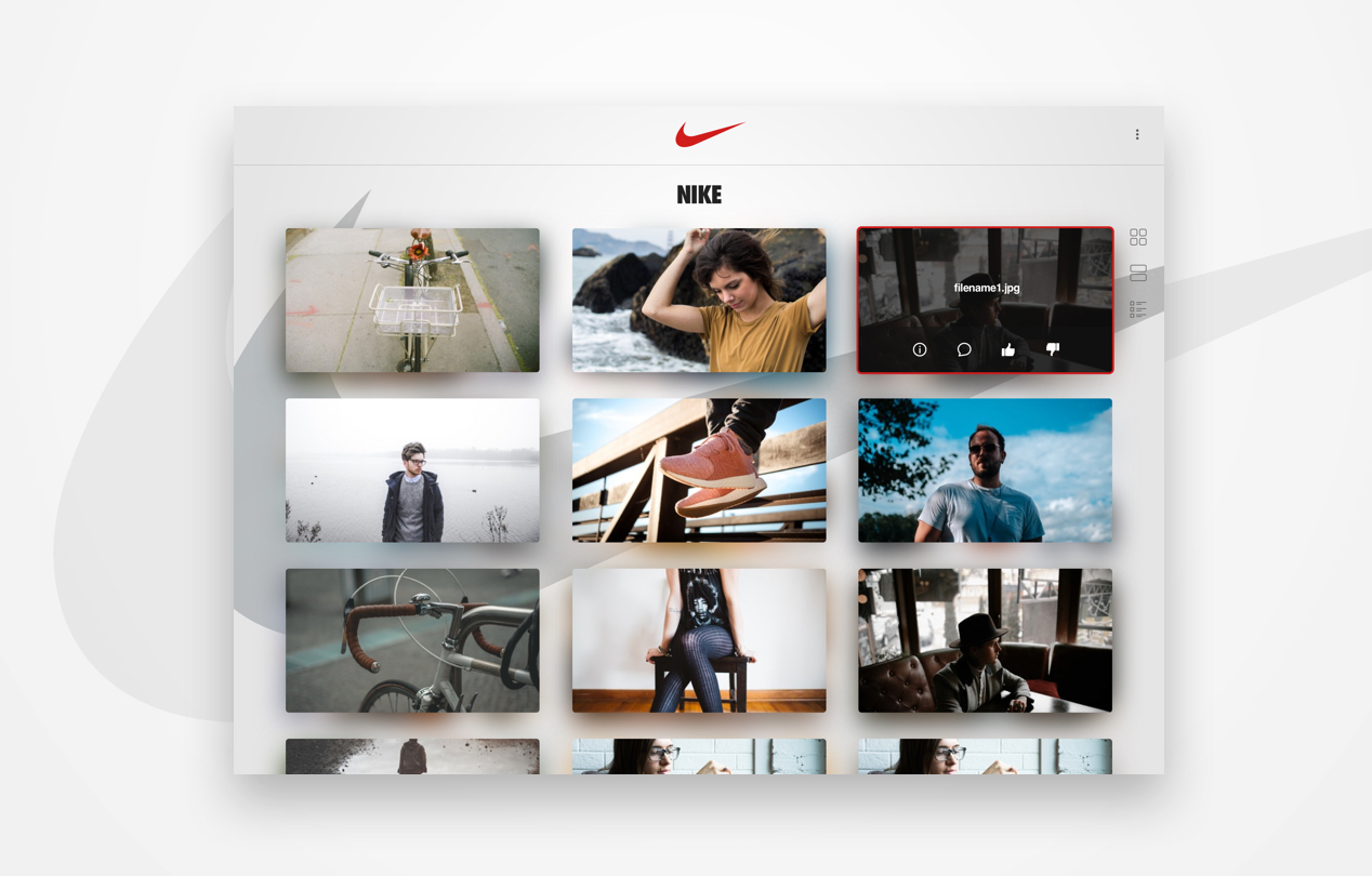
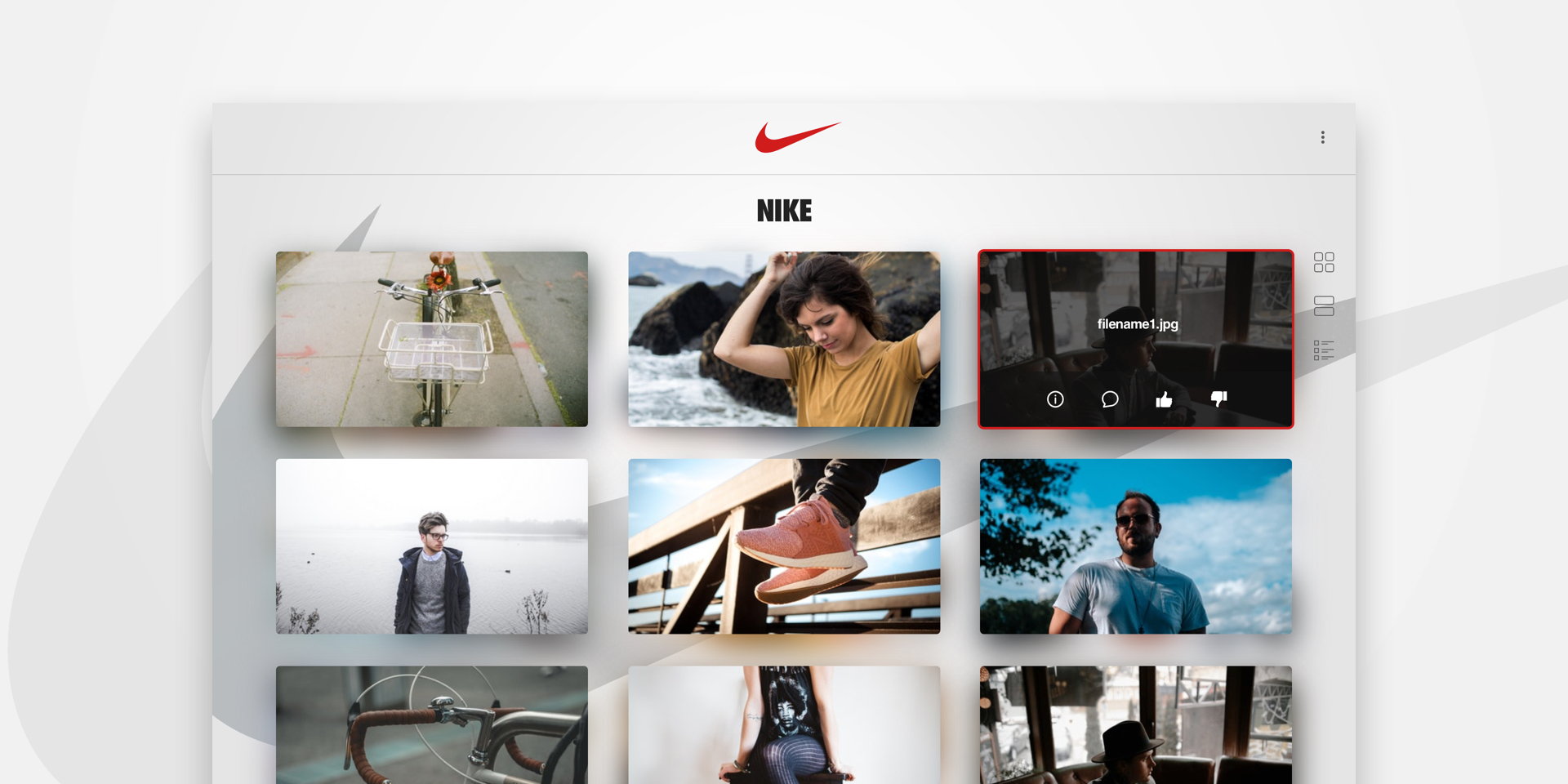
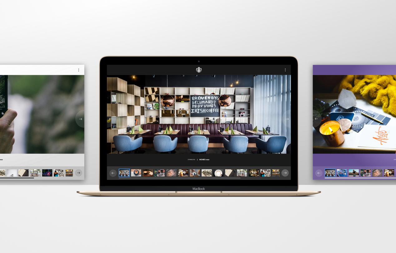
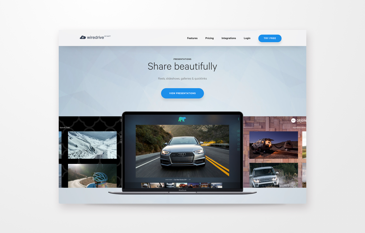
Presentations is exactly that. It is a paid service that provides an avenue of sharing and collaborating of creative assets. At any stage of the process, clients share their work internally and externally. With over ten years of industry use and customizations, there are a ton of subtleties build into this product. Some of which were defined for only a handful of customers. To this point, Wiredrive built Presentations to cater to all clients, and very specific needs as well. Using Sketch and Invision, I mocked usable prototypes that were shared to gain interest and insights.
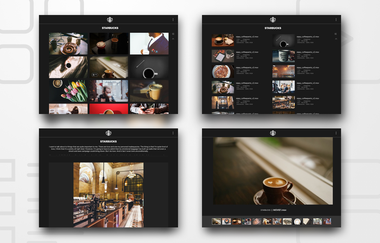
The main focuses of this product are the clients' assets. I needed to build a showcase that wasn’t overly complex. While showcasing the assets is the central focus, the ability to brand the experience is also a necessity. Presentations provides a micro site feel. An intimate sharing of designs, so a client can choose which creatives work best for them. View switching is a very useful tool in this application. A user can switch from a list, to a grid, to a micro-site feel called “blog”, to single asset “reel”. The customization is save-able by the client so the presentation arrives to the recipient as designed.
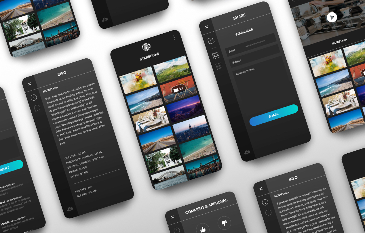
When an asset is selected, nothing else should be seen. This is a zoom in feature that focuses on one creative point. A user should be able to take action upon this asset via approvals, comments, and downloading. All assets in this set should be easily navigable, just as a set of photos on your phone. Keep the controls subtle, but make sure they can be easily found.
To keep the product exceptionally clean, I experimented with an action side panel. In wider formats, this would squeeze the main display, while in tablet and mobile, the panel would overlay the content. Because of the analytics based on our users, I understood that some people simply wish to view, while others have heavy interaction. Knowing this, the simplest answer is to show if needed, and keep expanded unless closed. This would surely satisfy all user needs.
A very needed addition to this project was the need for responsive design. Meeting with many clients, and soliciting a ton of feedback - the usefulness of being able to "take the project with you" was asked for implicitly by most clients. As our google analytics data proved this quantitavely true, responsive usability was a product and client MVP.
Being a web product, we were limited to using the native browser or os player. This meant Apple tablet and mobile products would lack VR and 360 video unless used in the native app. This would mimic Apple's known player, and was a small price to pay since the majority of our users aren't using either yet, but a good candidate for v2.
This piece of Wiredrive is something that clients use daily and is a part of their workflow. The term "just Wiredrive it to me" is a very real thing in the ad agency world. This meant that as the owner of the product, I couldn’t force it on people. Together, we decided to release beta, and slowly release the new version to clients. Very well received, our clients began asking how they could join the beta program.
Wiredrive's Presentations is now a fully released product. Working with together with our Marketing, Executives, and clients, we had a successful launch that is now prominently featured as a main sales point.

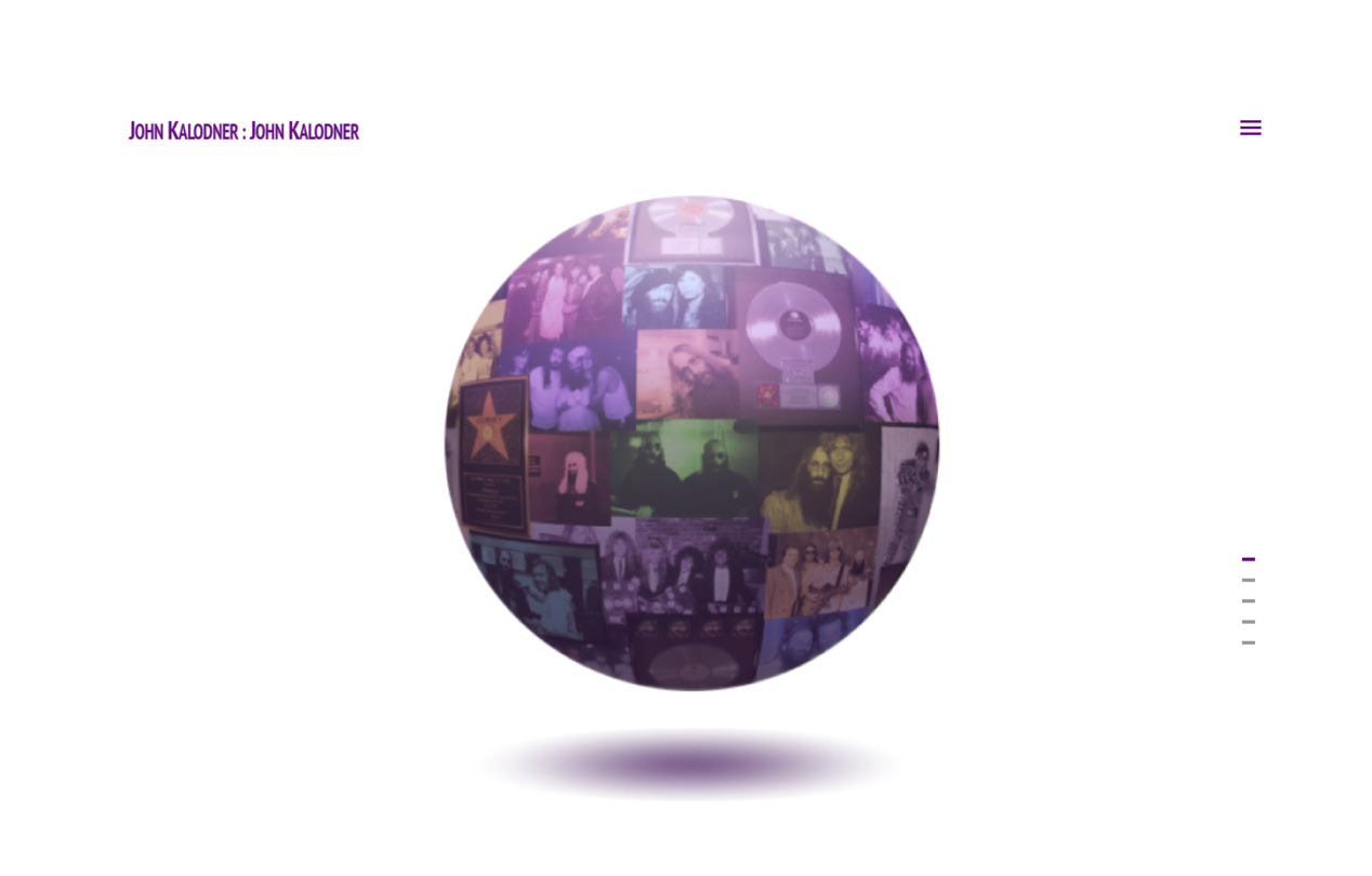
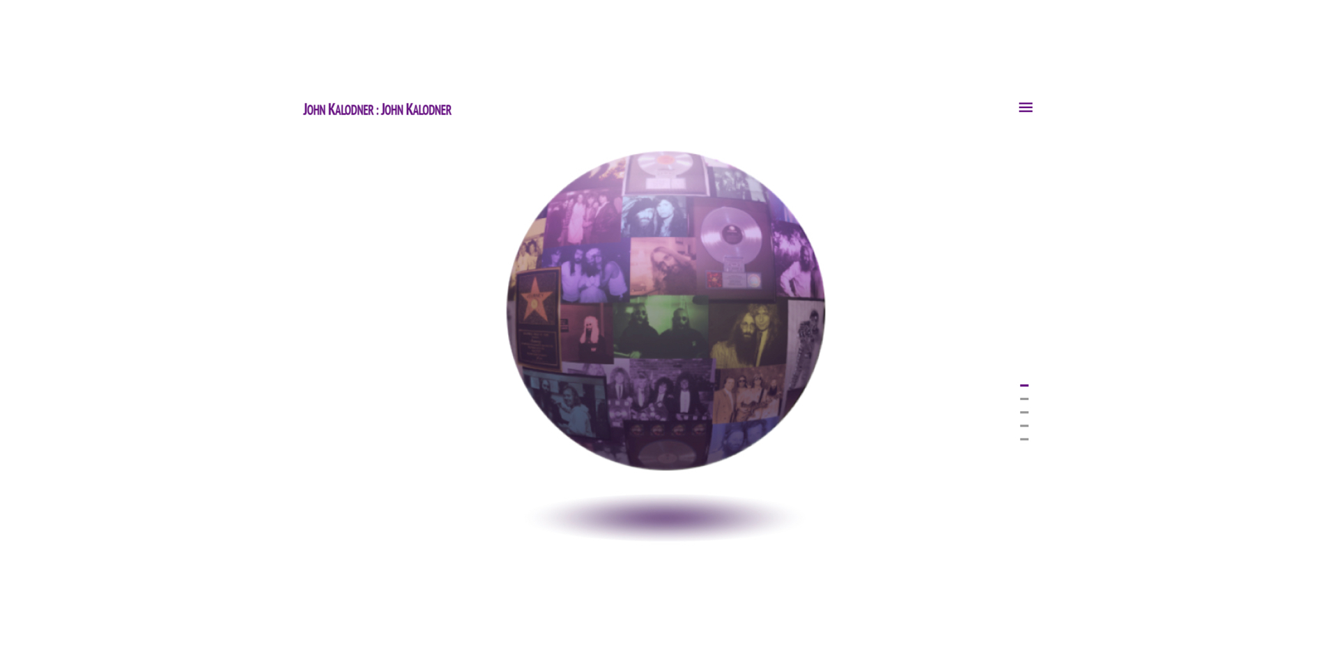
John Kalodner is an amazing human being. It was a great honor and privilege to work closely with him to gain his trust and confidence. Foreigner, AC/DC, Aerosmith, Bon Jovi, Billy Joel, Cher, KISS, Guns N’ Roses, Journey… the list goes on forever. How to capture the life of a person who gave the world so much great music is not an easy task.
I presented John with the sections, and we both agreed upon - bio, awards, photos, work, and news. This would give us enough flexibility to capture the majority of his work, and separate it into enough main sections. Being very particular is what sets JDK apart from most. His attention to detail had to be mirrored in the design.
This is an extremely photo-heavy site. Categorization was the primary focus. Because most people wouldn't be fishing for specific photos, a search didn't seem immediately necessary. This meant I would need to make sure everything was broken down according to some universal format that would make sense, and create an enjoyable discovery experience.
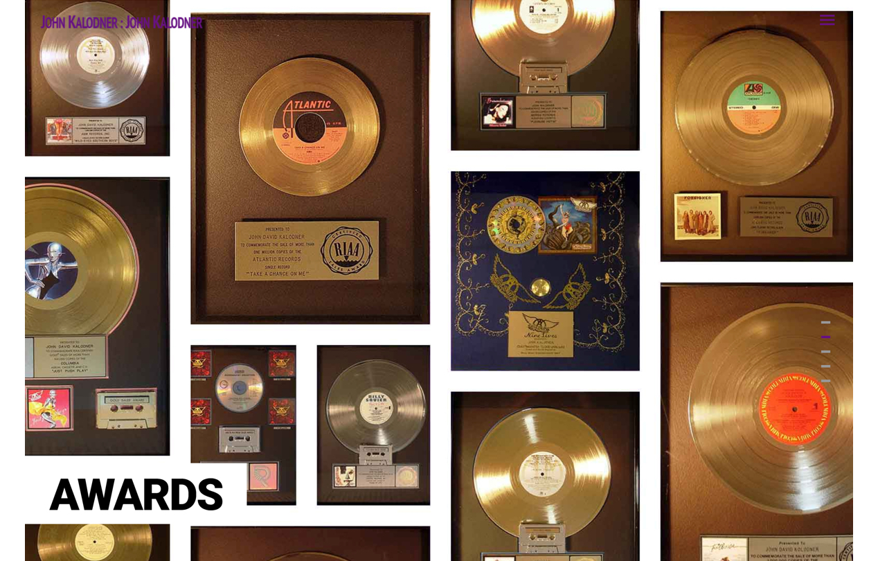
Awards - broken down by award type, then by individual artist. A user can easily browse through all awards or choose a specific artists' name to see all the awards JDK was given for each.
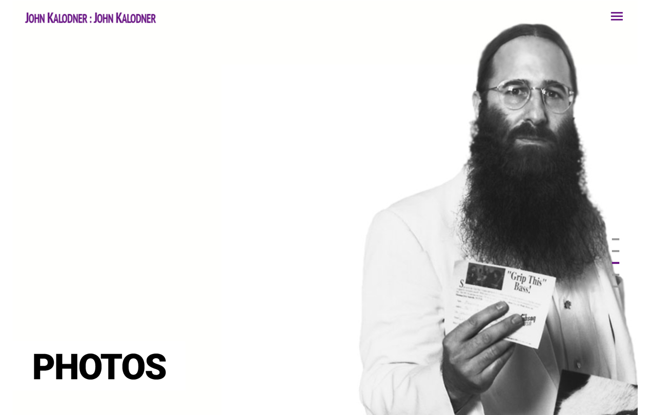
Photos - JDK has an exceptionally rich photographic history. Being a photography fan from a young age, he has captured nearly every age of his personal and work lives. Separating in both work and personal was a logical fit for this section, followed by decade.
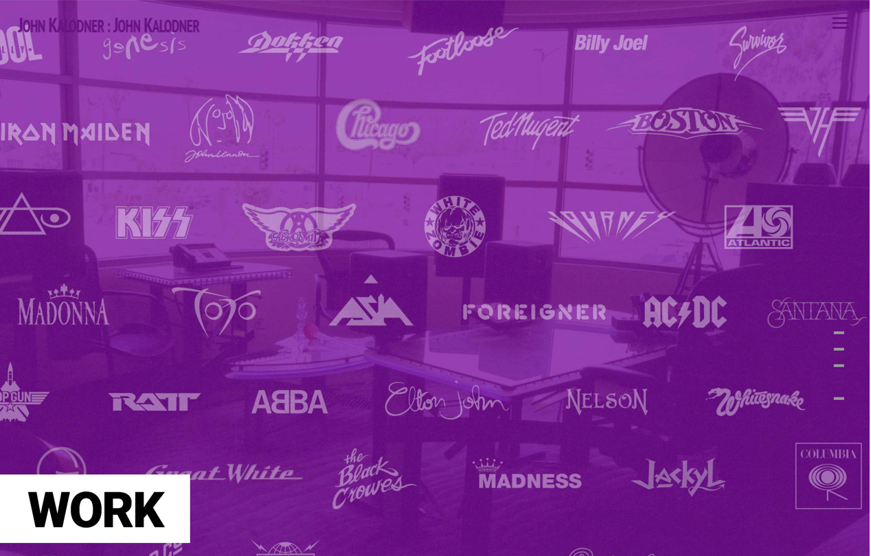
Work - JDK has worked with literally hundreds of musical acts. I chose to break down the information by places that he worked. Showing the dates for the years in which he worked for each would also provide a continuity to previously date-organized sections. The user mindset in this category is discovery.
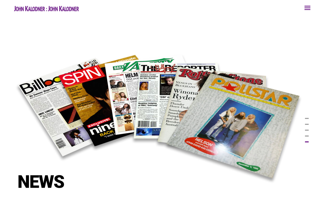
News - Before he was in A&R, JDK was a journalist. A large number of articles written by him and about him are included in this section. If a user is looking for any John Kalodner related news, they will easily find it. Because of the immense collection he has kept, there is literally a photo of each article ever written. Again, sorted by date - a user can easily browse the articles and discover a great deal of information.
The last piece of the puzzle was a contact area where people could get a hold of JDK. This was a slightly sensitive area, as he still gets solicited to work with artists, and listen to demos from new acts.
John asked me to be the point of contact for the site. Extremely honored, I accepted and still keep track of any requests that come in. As a favor to a dear friend, I will always help John with anything he needs.